Paper and Watermarks in Blake’s
An Island in the Moon
Fernando Castanedo (fernando.castanedo@uah.es) teaches at the Universidad de Alcalá, Madrid.
Research for this article was generously funded by Wellesley College’s Committee on Faculty Awards. I would like to thank paper historian Peter Bower for his kind help in answering my questions, and Suzanne Reynolds, Nicholas Robinson, Edward Cheese, and Emma Darbyshire for their generous assistance at the Fitzwilliam Museum.Although the watermarks in An Island in the Moon have been the object of research by several scholars, thus far they have not been clearly described or, I believe, reproduced. Both Palmer Brown and Paul Miner made inquiries in the 1950s with the staff at the University of Cambridge’s Fitzwilliam Museum, where Blake’s manuscript is kept, and Miner speculated on the identity of the paper.In response to a query by Brown of 2 July 1951, L. A. Holder (principal assistant at the time) answered, “Watermark resembles though not very closely, Churchill 216 (no cmk given). Countermark resembles that given for Churchill 213” (Holder to Brown, 19 July 1951). Holder’s references are to W. A. Churchill, Watermarks in Paper … in the XVII and XVIII Centuries … (Amsterdam: Menno Hertzberger & Co., 1935). Years later, in a 1 January 1958 letter, Miner asked the museum for confirmation that the watermarks and countermarks are “the same as fig. 20 (p 163) and fig. 25 (p 164)” in Thomas Balston, James Whatman, Father and Son (London: Methuen, 1957). Again, Holder clarified that they do not correspond to those in An Island (Holder to Miner, 27 August 1959). Correspondence quoted from the administrative file pertaining to An Island, Fitzwilliam Museum, Cambridge. In his 1977 Blake Books, G. E. Bentley, Jr., also noted the similarities between several Whatman watermarks and countermarks and those in Blake’s holograph.“The marks are similar to but distinct from figures 19 and 25 in Thomas Balston” (Blake Books [Oxford: Clarendon Press, 1977] 221n1). For watermarks in paper used by Blake, see Bentley, Blake Books 71-73 and Blake Books Supplement (Oxford: Clarendon Press, 1995) 40; Robert N. Essick, William Blake, Printmaker (Princeton: Princeton University Press, 1980); Martin Butlin, The Paintings and Drawings of William Blake, 2 vols. (New Haven: Yale University Press, 1981); and Peter Bower, “Blake’s Papermakers: Watermarks Found in Papers Used by William Blake,” The Oxford Papers: Proceedings of the British Association of Paper Historians Fourth Annual Conference, Held at St. Edmund Hall, Oxford, 17-19 September 1993 (Studies in British Paper History, vol. 1), ed. Bower (London: BAPH, Oak Knoll Press, 1996) 72-74 (appendix). Before I describe these devices and compare them with other watermarks from the same period, a review of the basic facts about the paper in this manuscript seems in order.Given its extremely fragile condition, the manuscript was remounted and set on hinges in 2015 in order to better its conservation.
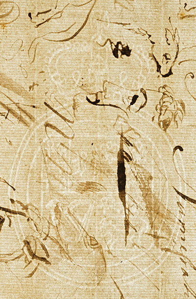
At the time of its donation to the Fitzwilliam by the painter Charles Fairfax Murray in 1905, the manuscript consisted of eight sheets of the English writing paper size known as foolscapFoolscap is a synecdoche for paper of a certain size that bore as watermark a fool’s cap. This paper became the most common for writing purposes. In the eighteenth century, according to Bower, the foolscap size was “usually indicated by a watermark of Britannia seated in a crowned oval. But in times of war … several English paper mills became very patriotic and used the Royal Arms in Foolscap sheets” (correspondence of 13 September 2016). Perhaps a patriotic mill such as this produced the paper watermarked with royal arms that Blake used for An Island. (308 x 374 mm.), folded and cut to form sixteen folios (leaves)—that is, a quire of thirty-two pages. Blake used folios 1 to 8, recto and verso, and almost half of 9 recto, to write the text in ink.In view of a diagonal pencil inscription on folio 9 recto reading “a leaf is evidently missing before this one,” editors have consistently suggested that one or two sheets might have been expunged from the middle of the quire. I have questioned this in “A Blake Riddle: The Diagonal Pencil Inscription in An Island in the Moon,” Blake 52.1 (summer 2018). Apart from several sketches and handwriting proofs (some with backwards lettering, as for copperplate engraving) on 16 verso,Folio 16 verso is titled The Lamb Lying Down with the Lion and Other Drawings, from “An Island in the Moon” Manuscript and catalogued as no. 149 in Butlin. the remaining pages were left blank—thus, folios 9 verso, 10-15 recto and verso, and 16 recto are all unused. Coincident pairings of watermarks and countermarks show that the folios were conjugate at some time prior to the manuscript’s bequest, and that each full sheet contained both a royal arms watermark, centered in one half of the sheet, and a crowned GR as countermark, centered in the other half.A description of the paper may also be found in Michael Phillips, ed., An Island in the Moon (Cambridge: Cambridge University Press, 1987) 3. While folios 2 to 8 bear identical watermarks, and 9 to 15 the corresponding countermarks, folios 1 and 16 invert this pattern, with 1 bearing the countermark and 16 the watermark. For some unknown reason, perhaps because he wanted the felt side of the sheet to act as a cover, or simply by chance, Blake turned the orientation of the outer sheet.
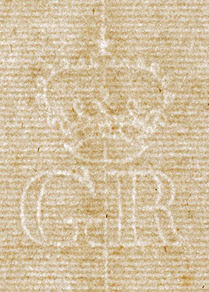
The countermark (39 x 29 mm.) presents a crown above the initials GR, Georgius Rex (King George) (illus. 1).According to Alfred H. Shorter, “The earliest known counter mark used by Whatman has been found in a paper of 1747 …. By 1750 he was using Britannia with JW incorporated in the device, and this is always found opposite the mark of the crown with GR, which possibly implies that the paper was made for some government department” (Paper Making in the British Isles [Newton Abbot: David & Charles Ltd., 1971] 56). Bower disagrees, however:The English monarchy have never had paper specially watermarked for their exclusive use nor do English government departments. One of the quasi governmental organisations, the East India Company did have its own watermark. The Crown / GR countermark predates George I by many years and did not originally refer to any of the King Georges. It was first used by several Dutch papermakers at the end of the 17th century and the early years of the 18th century when the GR initials stood for Gulielmus Rex, the latin form of William Rex, for William of Orange. Large amounts of Dutch made paper were imported into England until the middle of the 18th century so people were accustomed to seeing the GR countermark. By the time of the Georges many of the English mills were using the Crown GR countermark and people assumed the initials stood for George Rex. (Correspondence of 14 September 2016)
See an enlargement.
See an enlargement. See a grayscale enlargement with the shades inverted.
The main features of the paper in An Island (all measurements in mm.) are:
| Paper | Watermark | Countermark | Distance between chain lines | Collection | Date of use |
|---|---|---|---|---|---|
| 8 foolscap sheets 308 x 374 |
Royal arms 113 x 71 |
Crowned GR 39 x 29 |
26-27 | Fitzwilliam Museum, Cambridge | 1786, and possibly earlier |
| Catalogue and reference no. | Watermark size | Countermark and size | Distance between chain lines | Collection | Collection no. | Place of use | Date of use | |
|---|---|---|---|---|---|---|---|---|
| 1 | Heawood 447 | 113 x 73 | CT & Son 17 x 99 |
26-27 | Papermakers’ Association of Great Britain | Not provided, paper fragment | — | — |
| 2 | Gravell and Miller 141-42 |
113 x 73 | CT & Son 18 x 97 |
25-26 | Delaware Historical Society | Box 6 | Philadelphia, PA | ?1779 |
| 3 | Gravell and Miller 342-43 |
113 x 75 | HP 13 x 38 |
25-26 | Winterthur Museum, Garden & Library | Col. 363 74x16.11 |
York or Yorktown, ?NJ, NY, PA, VA |
1790 |
| 4 | Gravell Archive Arms.199.1 | 102 x 73 | — | 26-27 | Library of Congress, Thomas Jefferson Papers | Series 1: General Correspondence. 1651–1827. Box 9, #3433-19-88. Microfilm Reel: 005. | ?Middletown, CT | 1786–89 |
| 5 | Gravell Archive Arms.203.1 | 112 x 72 | M (size not provided) Ref.: LetterM. 004.1/TJ 48 |
26-27 | Library of Congress, Thomas Jefferson Papers | Series 1: General Correspondence. 1651–1827. Box 18, #8186. Microfilm Reel: 011. | Charleston, SC |
1789 |
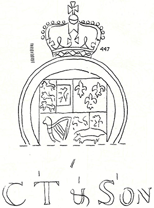
The watermark for document 1 (illus. 3) is found in a paper fragment that bears the countermark of Clement Taylor and Son, “CT & Son”, a well-known mill in Kent (see note 12). Heawood provides drawings rather than photographs of watermarks, which perhaps accounts for some differences in wire details. The limbs of the three lions passant guardant in the first quarter of the shield, for instance, are not represented by a single wire only, as they seem to be in the other examples. Also, the line that separates quarters three and four in the others, coincident with a chain line, seems to be absent in this one, but then Heawood does not indicate where chain lines run in this watermark (he does, however, point them out in the countermark, by three small vertical lines above it). Finally, the crown’s circlet is here composed of alternating diamonds and small circles, whereas in others, An Island included, it seems to have a central diamond and alternating small and large circles on both sides.
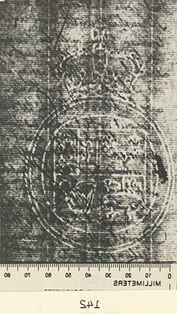
See an enlargement of the countermark. See a grayscale enlargement of the watermark with the shades inverted.
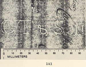
The crown in document 2 (illus. 4) apparently has precisely the same circlet as in document 1. Besides bearing identical watermarks of the same size, both documents present the same countermark (“CT & Son”) crossed by three chain lines at the same points—the left-hand line cutting through the “T” before the mast, the middle parting the ampersand, and the right-hand line between the “S” and the “o”. Given these similarities—despite the slight differences in dimensions for the countermark, which may well be because Heawood provides sketches—it seems very likely that the paper in both of these documents was produced in the same mould, or in moulds produced simultaneously at the same mill. The Clement Taylor and Son mill was active from 1781 to 1791 (see notes 12 and 14).
Document 3 is a commercial letter from William Harris to Andrew Clow & Company, merchants, Philadelphia. Harris placed his order on 16 November 1790 from a location that is written by him as both York and Yorktown, which possibly refers to towns in New Jersey, New York, Pennsylvania, or Virginia. The paper used is a sheet of approximately 298 x 368 mm., folded to form two leaves. This is roughly the same size as the sheets in An Island, 308 x 374 mm., which are near the regular dimensions for foolscap writing paper.
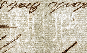
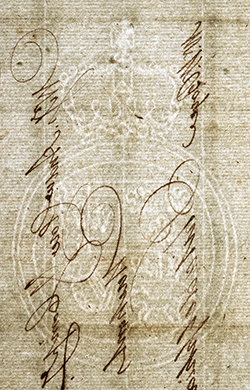
See an enlargement of the countermark. See a grayscale enlargement of the watermark with the shades inverted.
Although bearing a different countermark, “HP”, from An Island, document 3 presents the same watermark design (illus. 5).Butlin no. 120, The Good Farmer (c. 1780–85), bears also a mark with “HP”. A closer inspection, however, reveals a small difference in detail that indicates both the skill with wires of device makers and the rarity of finding sheets of paper produced in the exact same mould or batch of these, as might be the case with documents 1 and 2. In this regard, it must be stressed that watermarks were handmade and that important mills worked simultaneously with a considerable number of moulds bearing the same design but, inevitably, with subtle variations.As Heawood remarks, “Considering the large number of vats and even greater (perhaps double) number of paper moulds in use in any important establishment at the same time, it is not surprising that so few absolutely identical specimens of marks should be found in a collection drawn from many sources” (41). The differing detail in document 3 may be seen in the double outer border of the garter to the right of the shield in the image of the watermark (illus. 5), where the two wires are prominently apart.
As mentioned earlier, documents 4 and 5 are both available for examination online. They belong to the Thomas Jefferson Papers in the Library of Congress. The earlier is a copy of a letter from General Samuel H. Parsons to President Ezra Stiles of Yale College, originally dated 27 April 1786, probably in Middletown, Connecticut (illus. 6).“Samuel H. Parsons to Ezra Stiles, April 27, 1786, Exploration along Ohio River; Indian Mounds,” 04-27, 1786, Manuscript/Mixed Material, <https://www.loc.gov/item/mtjbib001909>. Parsons’s letter informs Stiles of his paleontological findings near the Ohio River. This copy, in two leaves—perhaps forming the same full sheet—has the following inscriptions on the verso of the second leaf: “General Parsons Letter to President Stiles 1786” and “Copy forwarded to his Excelly Gov. Jefferson Ambassador at Paris.” Jefferson held the office of ambassador to France from 1785 until 1789. Thus, the copy must have been produced between 27 April 1786, when the original was written by Parsons, and 1789, the end of Jefferson’s term in Paris.
The Gravell Watermark Archive does not mention the presence of a countermark in this letter, or which of the two leaves holds the watermark. It does, however, give a smaller size (102 x 73 mm.) for this device, which also appears to have a rounder shape than the rest. On the other hand, the number of wire lines between motifs does not vary, and the more circular aspect could well be because the image was taken from a different angle.
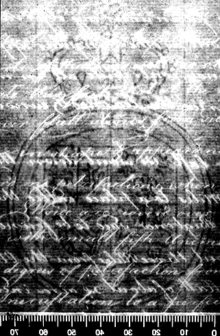
See an enlargement.
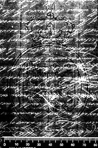
The last document with the same watermark design as An Island is a three-leaf “Extract from the Journals of the honorable Privy Council, at Charleston, in the State aforesaid [South Carolina]. / Friday 27th March, 1789” (illus 7).South Carolina Privy Council, 03-27, 1789, Manuscript/Mixed Material, <https://www.loc.gov/item/mtjbib004189>. Considering that the document is an extract from the minutes taken at that meeting, it must have been produced sometime after the council was held. Page 3 mentions a request by letter “from the Governor of South Carolina” on 4 April 1789, eight days after the meeting and perhaps prior to the document’s production. The 4 April date seems, however, to have been inscribed by a different hand, maybe at a later time. These leaves record a council meeting that discussed the payment of bonds issued by the state to foreign creditors, where Jefferson would act as provider of certificates. The document is signed “John Neufville, Secretary to the Governor.” According to the Gravell Archive, it bears a countermark with the letter M, which distinguishes it from the crowned GR countermark in the paper used by Blake.
See an enlargement of the watermark.
It would be interesting to know the exact size of the paper in documents 4 and 5, but neither the Gravell Archive nor the Library of Congress provides this information.A query about the size of the paper in both documents, the precise leaves bearing the watermarks, and the presence of other marks, etc., was made to the Manuscripts Division of the Library of Congress in June 2016. Nevertheless, the web site of the Library of Congress does supply full images of the documents, and the paper used in both appears to be of the same proportions as that in An Island. These two documents and Blake’s manuscript were written on laid paper of apparently the same foolscap size, with almost identical watermarks, equal distances between chain lines (26-27 mm.), and a like number of wire lines between motifs in the design.For instance, the number of wire lines between the upper border of the escutcheon and the inner line of the garter at the point where it meets the central chain line is consistently five. Were it not for the different countermarks in An Island and the privy council extract (document 5), one might judge that the paper in both, and possibly in the copy of the Parsons letter as well (document 4, with the caveat of the different size of the watermark), was likely to have been produced in the same British mill. According to Heawood, there are at least two plausible explanations for finding “two identical marks, maybe of a large size, associated with the names of two different makers.”Heawood 41.
The first would be a mill owned in partnership by two papermakers, where their different names would be inserted into the same moulds at different times. Heawood does not find this option fully convincing. A more probable explanation, in his view, might be found in the trading of whole stocks of moulds that would change hands from one firm to another. A subsequent change in the countermark could happen, as some instances have shown.Heawood 41. However, as Peter Bower points out, it is also well documented that mills would copy devices from high-quality paper to mark their own productions, thus appropriating prestige from competitors and increasing sales.According to Bower, “Mills generally designed their own marks but often copied designs that had originated in good quality papers. The initials of several papermakers were often appropriated by English papermakers as marks of quality. Examples include IV, the initials of Jean Villedary who worked several mills around Angouleme and LVG, the initials of Lubertus van Gerrevinck, of the Phoenix Mill at Alkmaar in Holland” (correspondence of 14 September 2016).
It would be tempting to conclude that documents 3-5 (all produced from 1786 on), along with the uncertain date of 1779 for document 2, provide some evidence for dating An Island. They do not. It would be highly speculative to relate the paper in these documents to that used by Blake to transcribe his satire.Phillips describes An Island as “largely fair copy” (5), while David V. Erdman regards it as “obviously copied from an earlier draft, the most frequent revision being a second thought replacing a word just written down” (The Complete Poetry and Prose of William Blake, ed. David V. Erdman, newly rev. ed. [New York: Anchor-Random House, 1988] 849). Bentley points out that it might well have been written in various stages over a period of time (Blake Books 223), and Phillips agrees with this as well. Essick, however, questions why Blake would have produced a fair copy before finishing the manuscript (rev. of An Island in the Moon, ed. Michael Phillips, Huntington Library Quarterly 52.1 [winter 1989]: 141). Considering how loosely structured An Island is—in the Lucianic tradition an end for dialogues or situations of this kind is extremely vague—and also the importance and number of unedited poems included by Blake in the manuscript, I tend to agree with Phillips and Erdman that the satire is, for the most part, a transcription of previously drafted and edited material. First, the fact that the paper was produced in Britain and used in the United States would have to be taken into account, and there seems to be no relevant scholarship on British exports of paper to the United States in the first years of the republic. More generally, as Heawood remarks, the furnishing of watermarks and documents for dating purposes, whether the first are produced to date the second or vice versa, may barely provide conclusive evidence.The use of paper many years after it was produced is, of course, very common. Blake himself, as Bower points out, used paper that “was nearly thirty years old when [he] began working on John Linnell’s commission to illustrate the Divine Comedy” (“The Vivid Surface: Blake’s Use of Paper and Board,” William Blake: The Painter at Work, ed. Joyce H. Townsend [Princeton: Princeton University Press, 2004] 59).
Finally, another source of information that ought to be considered in the future lies in works by Blake catalogued as bearing marks possibly coincident with those in the satire. Butlin, for instance, lists sixteen early works as marked “‘GR’ and coat of arms.”See Butlin p. 627 and my appendix. That Blake was frequently using laid paper of similar quality and size at this time can be seen in his Tiriel (1789), where the countermark is an identical crowned GR, and the watermark also shares some prominent elements.See G. E. Bentley, Jr., ed., William Blake: Tiriel (Oxford: Clarendon Press, 1967) 52-53. In Tiriel, however, the crowned GR countermark has chain lines crossing at different points, and the watermark shares the same crown and garter, but with the figure of Britannia instead of the royal arms. In sum, should dated paper of the same size and bearing the same watermark-countermark pairing as in Blake’s An Island be found, it might be possible to pursue further analysis.
Appendix: Works Catalogued in Butlin as Marked GR and Coat of Arms
No. 12 Countess Aveline, Side View of Her Tomb, c. 1775
No. 15 King Sebert, the North Front of His Monument, c. 1775
No. 17 Henry III, from the Wall-Painting above the Monument of King Sebert, c. 1775
No. 25 Queen Eleanor, Head and Shoulders from Her Effigy, c. 1774
No. 26 Edmund Earl of Lancaster, Side View of His Tomb, c. 1774–79
No. 27 Edmund Earl of Lancaster, His Effigy Seen from Above and Detail of the Painted Trefoil in the Centre Pinnacle, c. 1774–79
No. 28 William de Valence, Side View of His Tomb, c. 1777
No. 30 Aymer de Valence, Side View of His Tomb, c. 1774–79
No. 34 John of Eltham, His Effigy from Above, 1777
No. 37 The Children of Edward III, Their Effigies Seen from Above, c. 1777
No. 38 Queen Philippa, Side View of Her Tomb, c. 1774
No. 40 Queen Philippa, Head and Shoulders from Her Effigy, c. 1774
No. 41 Edward III, Side View of His Tomb, c. 1774
No. 42 Edward III, His Effigy Seen from Above, c. 1774
No. 45 Richard II and Queen Anne, Their Effigies on the Tomb Seen from Above, c. 1774
No. 46 Richard II, Head and Shoulders from His Effigy, c. 1774
