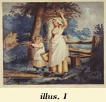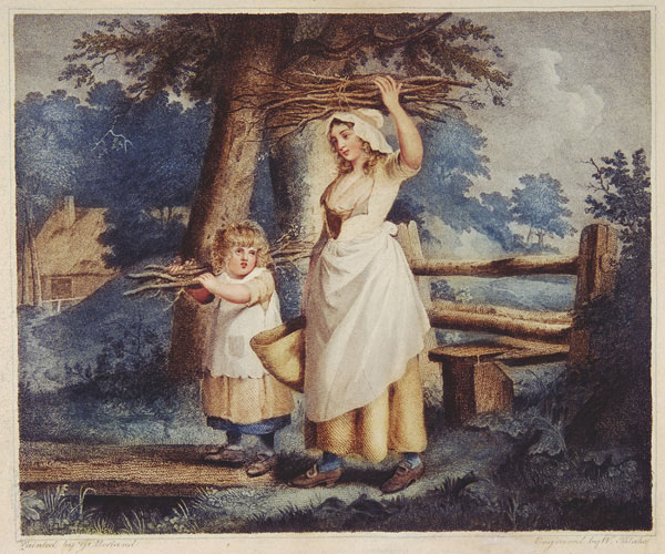
| 1. William Blake, Industrious Cottager. Stipple and line engraving after George Morland, color printed. Platemark 27.3 x 30.5 cm. (all measurements are of platemarks unless otherwise specified), 1788. Collection of Robert N. Essick. |
| 1. William Blake, Industrious Cottager. Stipple and line engraving after George Morland, color printed. Platemark 27.3 x 30.5 cm. (all measurements are of platemarks unless otherwise specified), 1788. Collection of Robert N. Essick. |
| 1. William Blake, Industrious Cottager. Stipple and line engraving after George Morland, color printed. Platemark 27.3 x 30.5 cm. (all measurements are of platemarks unless otherwise specified), 1788. Collection of Robert N. Essick. |
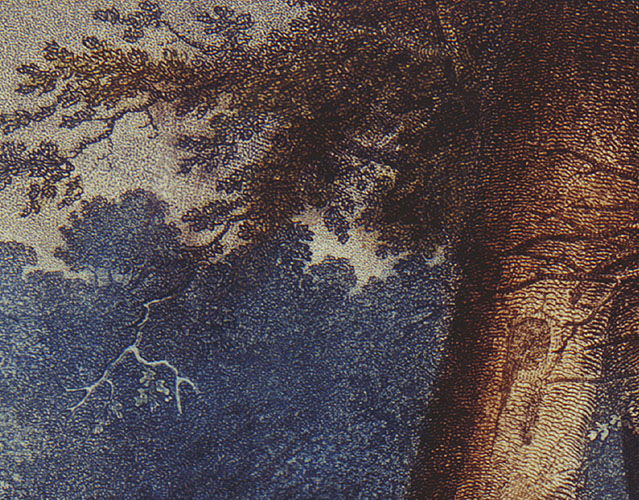
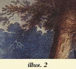
| 2. William Blake, Industrious Cottager. Stipple and line engraving after George Morland, color printed. Platemark 27.3 x 30.5 cm., 1788. Collection of Robert N. Essick. Detail showing the blending and overlapping of colors. |
|
|
|
|
| 2: BACKGROUND & CONTEXT |
|
Nevertheless, five of the six books listed in the prospectus as being in illuminated printing (E 693) were indeed printed in colored inks, usually yellow ochre, raw sienna, or green, but only in a single color in any one impression. Blake would print a few copies of each book in one printing session, often changing ink during the session for those books in print runs of more than ten copies (e.g., Songs of Innocence, The Book of Thel, and Visions of the Daughters of Albion) to diversify the copies, and had by this time printed approximately 62 copies of the six titles (Viscomi, Idea 376). Nearly all the pages making up these copies were finished in water colors. The coloring style was very simple, with just a few light washes in the images and rarely in the text areas. Blake adapted a standard practice for coloring prints, washing (i.e., painting in transparent water colors) sets of them with his assistant, his wife Catherine, before they were assembled as pages in books. The practice of coloring prints was a small cottage industry in England at this time (the colorist usually adding only one or two colors before passing the print to the next colorist, who adds her colors), and all the major printsellers, such as John and Josiah Boydell, Thomas Macklin, and James Sayers, offered separate prints both monochrome and colored. No one but Blake, however, offered works in illuminated printing, and no one but Blake was producing colored prints as illustrated text pages in books. By the fall of 1793, the illuminated books consisted of two kinds
of relief-etched prints, monochrome and colored. The popularity of color and colored printsand the tonal intaglio
processes of stipple, aquatint, and mezzotintreflects the periods
interest in facsimile reproductions of paintings and drawings. Such
works conceal their printness, their graphic syntax by which an image
in one medium (oil painting, water color, etc.) is translated into another
medium (etching, mezzotint, etc.).
Given the coloring technique, it was impossible for any two such prints
to be identical, and because the cheap drudges employed by the printsellers
to execute this delicate and difficult task of finishing them in water
colors lacked the practised hand, the cultivated eye, and the consummate
judgment of a master, the resulting performances must ever remain
unworthy [of] the attention of those who possess the smallest pretensions
to Taste. Landseers criticism is harsh and biased, the view of the outsider
angry about the engravers lowly status as copyistas well as about
losing his market share to tonal and color printmakers. Yet, he does
point to the inherent difficulty of color printing à la poupée.
Industrious Cottager, The alternative to printing multiple colors on one plate in a single pull through the press was to print multiple plates, all the same size, with each plate carrying one color and all the plates registered in exactly the same position on the paper. Landseer does not comment on multiple-plate color prints, probably because they were exceedingly rare. No one in England was using the technique in the 1790s, and only a few printers on the Continent were. But given that the technique was invented to produce prints that looked even more like their models than color prints produced in one pull through the press, he would have certainly disapproved. Nor would Landseer have been appeased by the separation of colors and the elimination of the need for the printer to be an artist, or even by impressions not having to be subjected to the hand-colorists, those ignorant pretenders to Art . . . the cheap drudges . . . who can scarcely hold a pencil (182). These, however, are the features that made multiple-plate printing more mechanical and thus more able to produce numerous and near-identical prints (Lilien 83). In other words, multiple plates were not only a way to ensure consistency, but also a way to eliminate the painter from the reproduction of paintings and drawings. The first color printing using multiple plates was chiaroscuro woodcuts in imitation of tinted drawings common in the Renaissance. Line drawings on tinted paper with highlights in white gouache (an opaque watercolor, sometimes called “body color”) were reproduced with a key or outline block and a second block cut in the broad shape of the wash with selected areas cut out so that the white of the paper would serve as the highlights (the so-called German type). To reproduce wash drawings in which the tints and highlights define both outline and modeling required reducing the drawing to three or four tints and cutting separate blocks for each, with highlights cut away from the blocks. The tone blocks overlapped to create intermediate tones (the Italian type). Chiaroscuro woodcuts were produced primarily in Italy and Germany in the 16th and 17th centuries, and eventually in France and the Netherlands. English engravers, however, did not learn the process until the early 18th century, and even then it was rarely practiced (Friedman 3). The few English engravers who produced chiaroscuro prints (e.g., Charles
Knapton, Elisha Kirkall, and Arthur Pond) used mezzotint or etched plates
as the key plate and wood blocks for tones and highlights, a mixed-method
technique that was first used by Nicolas Le Sueur in Paris for Crozats
Cabinet (1741), a collection of prints in imitation of old master
drawings. An earlier and even more intriguing venture in multiple-plate color
printing also failed. Jacques Christophe Le Blon (1667-1741), who was
trained as a painter and engraver, invented a way of printing pictures
(Le Blon 6) using three mezzotint plates, each printed in one of the
primary colors (red, yellow, blue, with occasionally a fourth plate
in black) and registered on the paper to reproduce all the compound
colors of the original drawing or painting. His first color prints were
produced c. 1704; in about 1720, he came to England where mezzotints,
which are ideally suited for reproducing the tonal gradations characteristic
of oil paintings, were far In the dedication to Coloritto (1725), Le Blons book on color theory, which explains the theory behind color printing but not the practice, he states that he fell upon [his] Invention of Printing Objects in their natural Colours while attempting to understand the theory of color, and that the invention assisted him in that understanding till [he] arrivd at the Skill of reducing the Harmony of Colouring in painting to Mechanical Practice, and under infallible Rules (iv). Le Blons invention anticipates modern color separation, but he did not have the aid of cameras and optical filters to analyze the colors of a painting into the primary colors. This he did by eye and trial and error till he achieved the correct proportions of each color. He likened his theories about the mixture of Material Colours to Isaac Newtons theories in the Optics on light, or Impalpable Colours (Le Blon iv). Although Le Blons three-color mezzotint process was not used in England after he returned to Paris, it was well known. Robert Dossie, in the Handmaid to the Arts (1758), described the technique and noted that it would remain neglected . . . unless revived by the patronage of some great person or society, who may conveniently bear that expence, which artists . . . cannot prudently engage in (2:185-86). The method was, however, continued in Paris by a few of Le Blons pupils. The best of them, Jacques Fabian Gautier DAgoty, produced work that shows a marked superiority to Le Blons, particularly evident in his prints for Myologie complette of 1746 (Friedman 10). Printing multiple colors from one plate was the standard practice for producing color prints during Blakes lifetime for good reason: it produced results closer to actual paintings than hand-colored black and white prints, and it cost less than any of the multiple-plate techniques. To summarize the two basic processes: in à la poupée printing, the plate is painted anew for each impression, which is then finished in water colors; in multiple-plate printing, each plate is inked in only one color, and the plates are registered to overlap in the impression to reproduce the secondary and tertiary colors and tones. The former requires a painters touch and mind; while the latter, dedicated to producing identical impressions, requires the eyes and hands of a printer skilled at registration. |
| 0:
SUGGESTIONS FOR READERS FOR OPTIMAL VIEWING 1: INTRODUCTION 2: BACKGROUND & CONTEXT 3: BLAKE'S COLOR PRINTING METHODS 4: THE TWO-PULL THEORY 5: THE ARGUMENTS FOR AND AGAINST TWO-PULL PRINTING 6: WHY "NURSES SONG" WAS PRINTED TWICE 7: OCCAM'S RAZOR 8: POSTSCRIPT: SOME IMPLICATIONS 9: NOTES 10: LIST OF ILLUSTRATIONS 11: WORKS CITED |
|
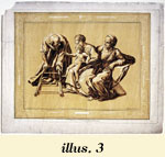
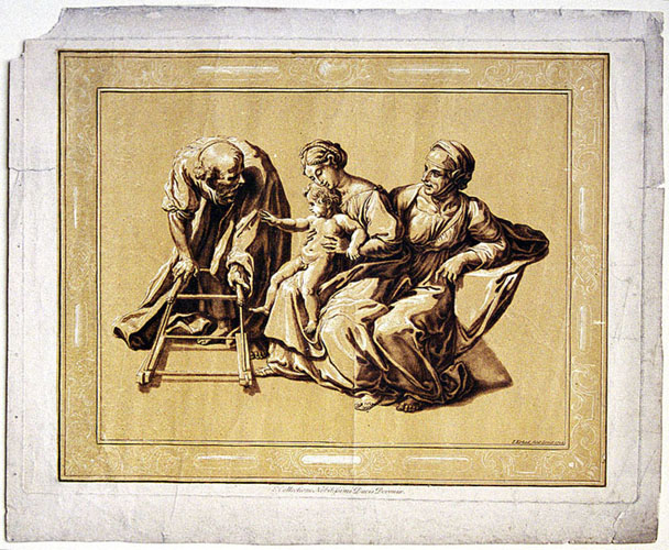
3. Elisha Kirkall, The Holy Family.
Mezzotint and chiaroscuro, 29.5 x 40.0 cm., 1724. Yale Center for British Art, Paul Mellon Collection.
|
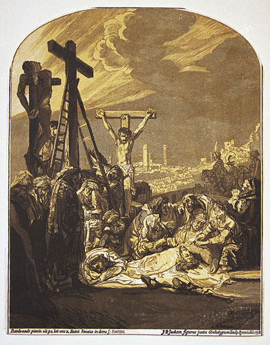 |
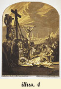
| 4. John Baptist Jackson, Descent from the Cross, after Rembrandt. Chiaroscuro woodcut, 35.5 x 27.8 cm., 1738. Yale Center for British Art, University Art Gallery Collection, Gift of Ralph Kirkpatrick. |
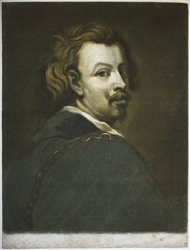 |
| 5. Jacques Christophe Le Blon, Van Dyck Self Portrait. Three-color mezzotint, 61.2 x 36.0 cm., c. 1720s. Yale Center for British Art, Paul Mellon Collection. |
| 3. Elisha Kirkall, The Holy Family. Mezzotint and chiaroscuro, 29.5 x 40.0 cm., 1724. Yale Center for British Art, Paul Mellon Collection. |
| 4. John Baptist Jackson, Descent from the Cross, after Rembrandt. Chiaroscuro woodcut, 35.5 x 27.8 cm., 1738. Yale Center for British Art, University Art Gallery Collection, Gift of Ralph Kirkpatrick. |
| 5. Jacques Christophe Le Blon, Van Dyck Self Portrait. Three-color mezzotint, 61.2 x 36.0 cm., c. 1720s. Yale Center for British Art, Paul Mellon Collection. |
| 2. William Blake, Industrious Cottager. Stipple and line engraving after George Morland, color printed. Platemark 27.3 x 30.5 cm., 1788. Collection of Robert N. Essick. Detail showing the blending and overlapping of colors. |
| 4 How
Blake identified The Book of Ahania (1795) and The Book of
Los (1795), in which the text pages were printed from intaglio plates,
is not known. Today they are routinely classified as illuminated books,
perhaps because of their color-printed frontispieces, title pages, and
vignettes. All copies of Gates, however, were printed in black
ink and left uncolored. |
| 5 Monochrome impressions, whether printed in shades of black ink, such as those in most copies of America (and, later, Jerusalem) or in colored inks, such as those in The Marriage of Heaven and Hell copy B (1790) and the Experience section of Songs of Innocence and of Experience copy O, were produced and sold as monochrome copies and should not be considered unfinished. Copy designations and plate numbers for the illuminated books follow Bentley, Books. |
| 6 Lauries
method combined on one plate mezzotint, stipple, and, for the outlines,
etching, which he inked warm with camel hair brushes with their tips cut
off to form stump brushes. He was awarded 30 guineas by the Society of
Arts in 1776 for the invention of this color printing method (see Burch
87 and Hardie 56-57). |
| 7 For the
concept of graphic syntax, see Ivins, esp. 60-62, and Gascoigne, where
the identifying characteristics of all the various relief, intaglio, and
planographic processes are clearly described and illustrated in magnified
details. |
| 8 According
to Landseer, The pretensions of engraving, as of all the arts denominated
Fine, are simple, chaste, unsophisticated. Art ever disdains artifice,
attempts no imposition, but honestly claims attention as being what it
is. A Statue is to be looked at as being a statue-not a real Figure;
a Picture, not as a portion of actual Nature; a Print, not as a copy of
Painting (178). |
| 9 Landseer
182-83. He goes on to claim that only the eye, the hand, and the judgment
of a Painter, can alone confer value on a coloured work of art-call
it picture, print, or whatever you please: nothing else can entitle it
to the denomination of a work of Art . Finishing, of course,
also required the genuine Painter, who (even were he to be well paid
for it) could never submit to stifle his inventive powers in the drudgery
of copying his own works, while by multiplying them, he lessened the nominal
value of each (183). |
| 10 The first
book in England with color prints was the Book of Hawking, Hunting,
and Heraldry, printed in 1486 in St. Albans, Hertfordshire (Friedman
4). Jacksons was technically the second book in England with color prints.
In the latter half of the eighteenth century, aquatint plates with etched
outlines replaced the key and tone blocks, making the facsimilizing of
wash drawings a relatively simple one-pull procedure, as Richard Earloms
facsimiles of Claude Loraines and Giovanni Ciprianis drawings attest.
French graphic artists like Gilles Demarteau used the chiaroscuro method
with aquatints (and other plates) to produce prints in imitation of paintings
(as distinct from wash drawings). |